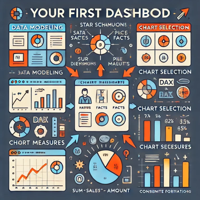
“This is my First Dashboard. Review it.”
You dragged and dropped some fields into visuals in Power BI. You have your first dashboard. You published it on social media. Comments say it’s … Read More
Blog by Andrzej Leszkiewicz. Power BI Developer and Consultant.
Power of Business Intelligence
Blog by Andrzej Leszkiewicz. Power BI Developer and Consultant.
You dragged and dropped some fields into visuals in Power BI. You have your first dashboard. You published it on social media. Comments say it’s … Read More
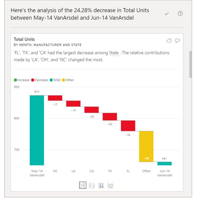
🔴 Use the Analyze feature to explain fluctuations in report visuals (Preview) About Microsoft Learn. Once again. For me, the data visualization content on Microsoft … Read More
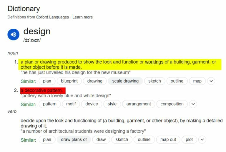
How to improve your dashboard design? 🔴 Stop treating dashboard design as a decorative pattern. 🔴 Stop googling “How to design a beautiful background for … Read More
You are an executive, manager, business professional. You want a dashboard or a report. 📉📈 How and whom to ask for it? Well, this post … Read More
🔴 “Data visualization is easy to learn part of Power BI” Not easy at all. Not easier than data modeling. ➡️There are many data visualization … Read More
👨⚕️ Healthcare professional (doctor): “I diagnose illnesses and choose treatments based on statistically verified protocols. A client chooses a hospital but does not tell the … Read More
Dark themes for business reports? I’m currently reading a few posts by different people from the past year and trying to understand the reasoning for … Read More
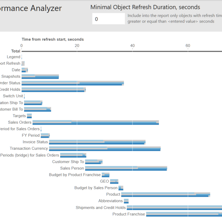
To understand why a Power BI report refresh takes too much time, we can use SQL Server Profiler. SQL Server Profiler can be connected to … Read More
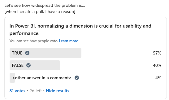
Okay, Power BI community, we have a problem. 80+ votes is already enough to confirm that we indeed have a problem. “In Power BI, normalizing … Read More
This post is an update for What is new? One of the users has found a critical issue in the old version of the report: … Read More