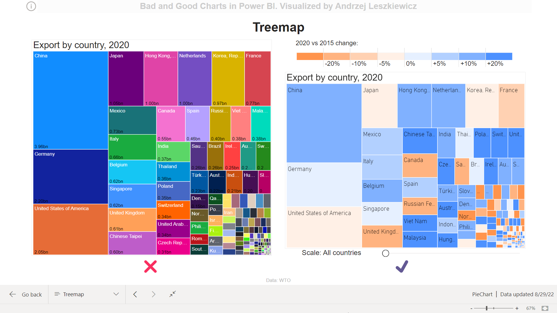
Better Treemap with meaningful colors and scaling
How to show almost 200 countries data on a treemap visual?
For this experiment I took international trade statistics (merchandise exports by product group, annual) from https://stats.wto.org/ web site and built a simple data model (surely, it’s a star schema):

And I created a simple [WTO Export] measure:
WTO Export :=//WTO Export (mln usd)
SUM ( ‘WTO Export'[Export (mln usd)] )
Now it’s so easy to build a treemap. Insert a visual, drag and drop Country column into Category field and the measure into Values field:
Category: ‘WTO Export'[Country]
Values: [WTO Export]
One more thing to add is a filter by Year to show only 2020 data.
Lady and gentlemen, the treemap!

Easy? Easy! Ready! Ready? Good? Not really.
The main problem with this default color formatting (one country box = one automatically assigned random color) is that a color means nothing. You will argue that a color means a country. But even without colors it’s clear that one box = one country, the colors add nothing. At the same time no one will be able to remember almost 200 countries and corresponding colors (and shades of the same colors). So, are colors meaningful, do they provide any additional information about our data? No.

How we can use colors to get more information about the data?
Well, we can color countries by regions (e.g. Europe, Middle East, Africa etc.) to get more details about our country dimension. But can we get more details about the fact ([WTO Export])? What to analyze depends on your goal, but I decided that I want to see how each country’s export changed in 2020 if compared with 2015 export (I included only 2015-2020 data into my dataset).
Next measure is [WTO Export Change]:
WTO Export Change :=//WTO Export Change (last year vs first year), %
VAR _Year1 =
MINX ( ALL ( ‘WTO Year’ ), ‘WTO Year'[Year] )
VAR _Year2 =
MAXX ( ALL ( ‘WTO Year’ ), ‘WTO Year'[Year] )
VAR _Value1 =
CALCULATE ( [WTO Export], TREATAS ( { _Year1 }, ‘WTO Year'[Year] ) )
VAR _Value2 =
CALCULATE ( [WTO Export], TREATAS ( { _Year2 }, ‘WTO Year'[Year] ) )
VAR _Result =
DIVIDE ( _Value2 – _Value1, _Value1 )
RETURN
_Result
I added the measure to the Tooltips field. But how to color the treemap by this measure?
We need color ranges and we need a legend.
It means we need a new table.
Legend for Treemap (colors) =//Treemap (WTO data) legend
DATATABLE (
“Index”, INTEGER,
“Color”, STRING,
“Label”, STRING,
“Value”, INTEGER,
{
//orange
{ -4, “#FF944D”, “”, -9999 },
{ -3, “#FFB380”, “-20%”, -20 },
{ -2, “#FFD1B2”, “-10%”, -10 },
{ -1, “#FFF0E6”, “-5%”, -5 },
//blue
{ 0, “#E6F0FF”, “0%”, 0 },
{ 1, “#B2D0FF”, “+5%”, 5 },
{ 2, “#80B1FF”, “+10%”, 10 },
{ 3, “#4D91FF”, “+20%”, 20 }
}
)
Colors I created by choosing 2 colors (blue 4D91FF and orange FF944D, 70% saturation) and then changing saturation to 50%, 30% and 10%.
Now this table can be used to do both: to color the treemap and to make a legend.
A Matrix visual will work as a legend.
I created one more basic table:
Legend for Treemap (rows) =//2 rows for a legend
{ { 1 }, { 2 } }
‘Legend for Treemap (rows)'[Value] column is used as Rows of the Matrix.
‘Legend for Treemap (colors)'[Color] is used as Columns of the Matrix. Color values are strings of the same length and this property can be used to make sure all columns have the same width using auto-size width feature. I just needed to play with Column headers font size to choose column width that works for me (then I disabled auto-size and reduce font width to minimal to decrease the header row height).
And [WTO Legend Value] is used as a Value for the Matrix. It returns empty string in the first row and color range label in the second row of the Matrix.
WTO Legend Value :=//Legend value for second row (range label)
IF (
//first legend table row
SELECTEDVALUE ( ‘Legend for Treemap (rows)'[Value] ) = 1,
“”,
//second legend table row
SELECTEDVALUE ( ‘Legend for Treemap (colors)'[Label] )
)
Final touch is conditional formatting:

//Color legend matrix cells
IF (
//first legend table row
SELECTEDVALUE ( ‘Legend for Treemap (rows)'[Value] ) = 1,
SELECTEDVALUE ( ‘Legend for Treemap (colors)'[Color] ),
//second legend table row
“#FFFFFF”
)
The legend is complete:


//WTO Export Change Legend Color (hex)
VAR _ChangePercentage = [WTO Export Change] * 100
VAR _LegendFiltered =
TOPN (
1,
FILTER (
‘Legend for Treemap (colors)’,
‘Legend for Treemap (colors)'[Value] <= _ChangePercentage
),
‘Legend for Treemap (colors)'[Value], DESC
)
VAR _Result =
SELECTCOLUMNS (
_LegendFiltered,
“@Color”, ‘Legend for Treemap (colors)'[Color]
)
RETURN
_Result

Looks good. But I’m not satisficed. What about all these small boxes in the right bottom corner?
I need a way to zoom in the treemap.
And one more table is required:
Treemap Scaling =//For treemap (WTO data) scaling slicer
DATATABLE (
“Item”, INTEGER,
“Number”, INTEGER,
“Label”, STRING,
{
{ 1, 200, “All countries” },
{ 2, 150, “Bottom 150 countries” },
{ 3, 125, “Bottom 125 countries” },
{ 4, 100, “Bottom 100 countries” },
{ 5, 75, “Bottom 75 countries” },
{ 6, 50, “Bottom 50 countries” },
{ 7, 25, “Bottom 25 countries” }
}
)
And a slicer with ‘Treemap Scaling'[Item] column used for the Field:

//For Treemap scale (zoom) to show only N bottom items (countries)
VAR _Rank =
RANKX ( ALL ( ‘WTO Country’ ), [WTO Export],, ASC )
VAR _ScaleSelected =
MAXX ( ‘Treemap Scaling’, ‘Treemap Scaling'[Item] )
VAR _Number =
CALCULATE (
VALUES ( ‘Treemap Scaling'[Number] ),
‘Treemap Scaling'[Item] = _ScaleSelected
)
VAR _Result =
INT ( _Rank <= _Number )
RETURN
_Result
When we move slicer to the right we select smaller value in ‘Treemap Scaling'[Number] column and we filter out countries with larger export using country rank. For example, the last slider position means we include only bottom 25 countries.
Try it, it works really well:
Live Power BI report:


Do you see different color patterns? We have got some useful information here. Countries with the largest export were more stable or increased their export significantly, countries with the smallest export are divided: some lost their export significantly, some increased their export significantly. Further analysis is required. And this is on of the purposes of a good chart – to let us know in what direction we should continue our analysis.
Maybe someone did it before, but I can’t recall seeing a treemap with a zoom slider. I really love what I did here. Easy to see different patterns on different zoom levels. What do you think?
I’m sorry, I’m not ready to share the .pbix file, but DAX code for all calculated tables and measures has been posted on the above.