Shape Map
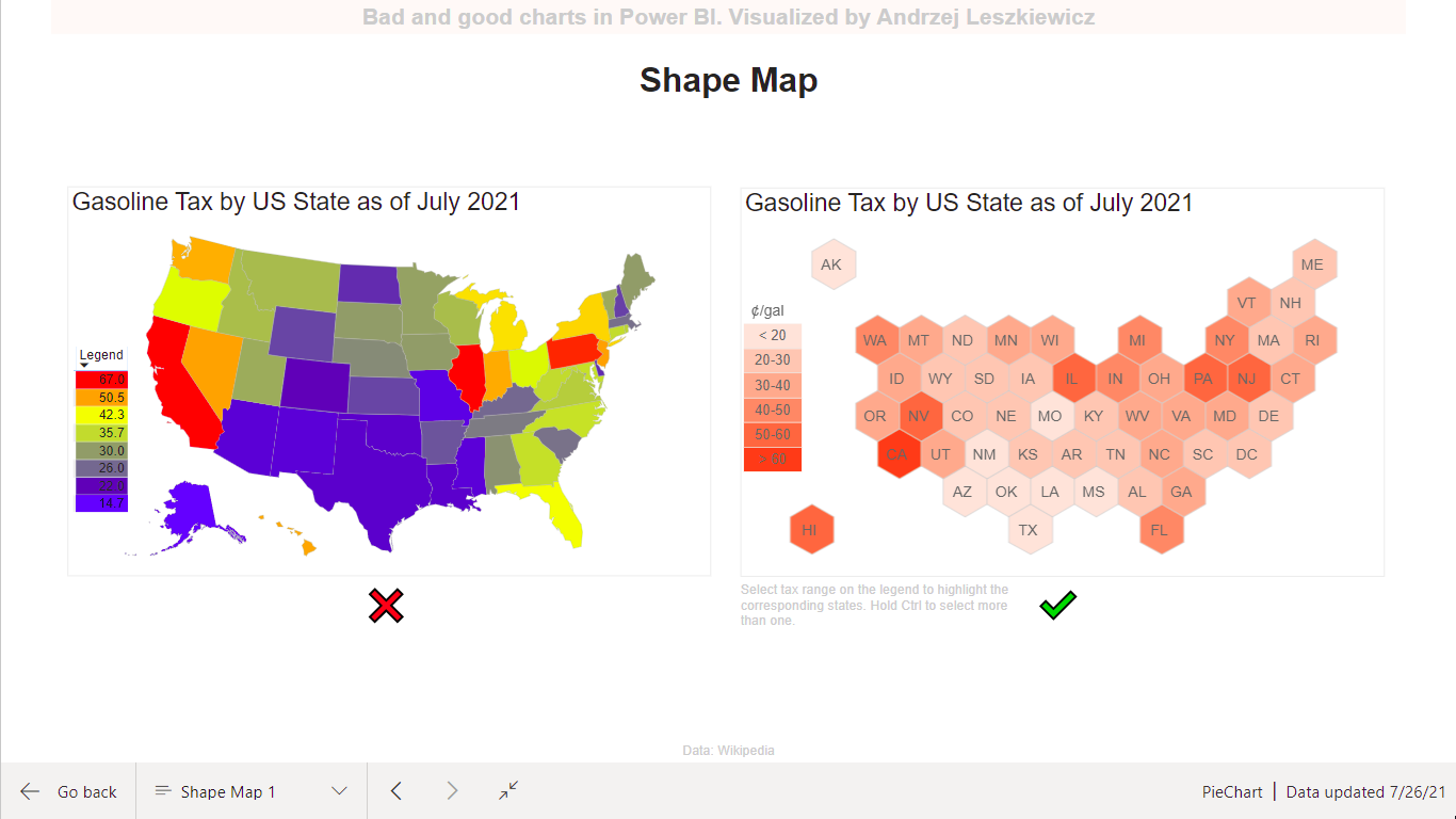
Why the map on the left is bad? Try to find Rhode Island or Delaware. Small states are almost invisible, large states are taking too much attention (especially when they are highly saturated). But In this specific case we’re visualizing fuel tax and we don’t really care about geographically correct shapes, areas or distances. It is probably a good idea to be able to see some regional patterns, but we don’t really need any geographical details. This why a cartogram on the right is a good choice for this specific case.
A cartogram on the right allows a user to see all states and the only significant difference between the states (other than position on the screen and relatively to other states) is color saturation (which is good, because color saturation actually represents the data).
Does it mean that a map is always worse than a cartogram? Not, it doesn’t. For example, if it’s a map of fuel prices and your audience is a driver, who is going to travel across the US and keep gasoline cost as low as possible. A map will be more useful than a hexagonal cartogram. And you’ll probably want to see even more details on the map – roads and gas stations.
The other problem with the map on the left is about colors. More colors doesn’t mean better and easier to understand. It’s easy to understand (even without a legend) that more saturated hexagons on the cartogram mean higher tax. But what about all these red, blue, orange and dirty yellowish colors on the map? Where gasoline tax is higher in WV or in VA? And what if you have colorblindness? This is how a person with Deuteranopia will see the maps:

Some charts are always bad (rainbow colored pie chart with a lot of sectors of similar size). Some charts are better or worse depends on your data and your target audience.
The map on the left is based on the Shape Mad visual.
The map on the right is based on the Icon Map custom visual.