🔴 Use the Analyze Feature to Explain Fluctuations in Report Visuals
🔴 Use the Analyze feature to explain fluctuations in report visuals (Preview)
About Microsoft Learn. Once again. For me, the data visualization content on Microsoft Learn is like table and matrix measure totals for Greg Deckler. I just need to start counting the days of how long Microsoft Learn continues to promote bad data visualization practices.
Sadly, Microsoft, represented by a dot in the top-right corner of the Gartner® Magic Quadrant™ for Analytics and Business Intelligence Platforms, doesn’t use Power BI documentation to increase data visualization literacy and doesn’t teach users with the best possible examples of data visualization.
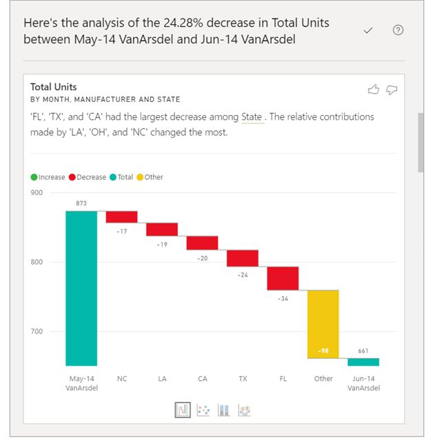
Additionally, regardless of how it’s presented on Microsoft Learn, the Analyze feature in your reports can produce misleading results or results that make no much sense. A good report should avoid charts that were not designed by a data visualization professional, who has a full understanding of why each chart is included into the report and why it looks the way it does.
Is the feature helpful for those who are not data visualization professionals? In my opinion, presenting badly formatted and potentially misleading charts to beginners, who may not yet have the experience to recognize how charts can be deceptive, is a recipe for disaster.
And it’s more than just chart formatting. Your measure decrease, because something else “decrease, increase or other”. Do you understand? I don’t.


Images: Microsoft Learn