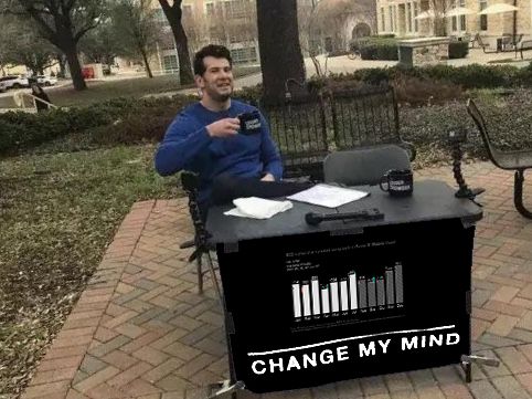
Dark Themes for Business Reports?
Dark themes for business reports? I’m currently reading a few posts by different people from the past year and trying to understand the reasoning for dark themes. But many arguments seem to be purely subjective and anecdotal. Maybe my arguments will be as well.
❓ “Dark backgrounds make the data stand out.”
There is no such thing as making the data stand out. We need to make certain important things stand out (e.g., by using a tiny bit of color), not every drop of data-ink. When every label is bright against a black background, it’s not about making anything important stand out. If everything stands out then nothing stands out.
❓ “It’s easier for my eyes to work with a dark theme during late-night hours.”
Maybe. Are you building the report for yourself? Does the report audience know that they must use the business reports during late-night hours? Do they use the report in full-screen mode or within a dark mode app? Or do they use the report within a light mode app? The latter would make my eyes scream in pain. That’s subjective, but do you have any statistics to support such decision?
And if you build both versions, does it mean you create the light mode version during the day and then build the dark mode version at night? Is it more beneficial to spend time creating two versions of the report, or would it be better to spend more time working on the data itself? Time/budget is rarely unlimited.
❓ “Dark theme is visually appealing/modern/professional.”
First of all, these terms are terribly subjective. Secondly, do you really think this is what makes a business report visually appealing, modern, or professional? Are you ready to die on that hill?
P.S. I have some dark mode reports, like one version of my Climate Change report. That’s not a business report. I do like how it looks (in full-screen mode only). I don’t care much about the data details in this report, just about the overall impression. The data details are much easier to show and highlight in a light mode version.

