“This is my First Dashboard. Review it.”
You dragged and dropped some fields into visuals in Power BI. You have your first dashboard. You published it on social media. Comments say it’s amazing, beautiful, and insightful.
But, let me be honest. That’s not how data visualization works. A first “dashboard” is rarely “amazing,” “beautiful,” and “insightful” (despite all the “amazing,” “beautiful,” and “insightful” comments). But it’s still good. If you’re just learning, any attempt is a learning opportunity. Even if it falls short from a data visualization perspective, it’s valuable for your learning. You’ve started learning. Don’t stop.
Just make sure your next dashboards aren’t just about repeating the same mistakes and reformatting (changing the visual appearance of the errors). Focus on:
Better understanding of data modeling.
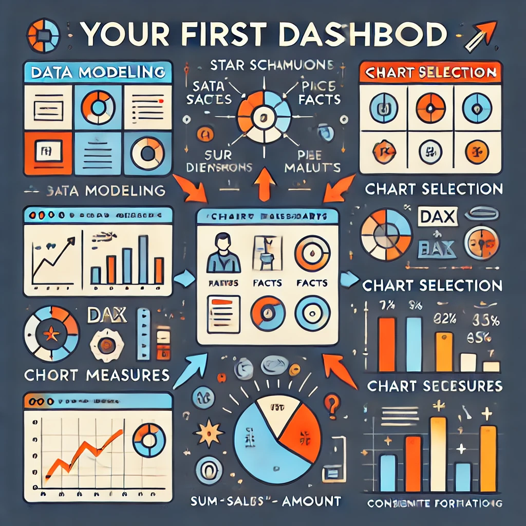
A star schema is good practice. Start practicing good data modeling from your first basic projects, such as a simple dashboard based on one fact table and 3-4 dimensions. It will be easier for you to understand more complex data models in the future if you have already seen how a simple star schema works.
I’m also guilty of talking about chart types and colors when asked to review a dashboard. The first technical question should be: “Show me a screenshot of the data model schema.” Data models are important for data understanding. Data models are important for further DAX calculations. Data models are important for upgradability and scalability.
A simple dashboard based on a poor data model may work now, but it will create too many problems later when you need to add a new chart to the dashboard or when the amount of data grows. Often, it’s easier to rebuild such a report from scratch than to fix all the issues. Therefore, start with proper data modeling, no matter how simple the project is.
Don’t use implicit measures. Start using simple DAX.
Do not drag and drop anything from the fact table. Use dimension tables (for slicers and for grouping in a visual) and explicit measures (measures you have created by writing DAX) only.
Write your first simple measures such as Sales Amount := SUM(‘Sales'[Amount])
Training: Add measures to Power BI Desktop models
Start with simple measures today, and DAX will be less scary tomorrow.
Avoid using calculated columns (at least in fact tables). Power BI is not an Excel worksheet; DAX works differently. Use measures.
Try visual calculations.
The reasons for including each visual.
Why is there a card for measure A (And what does this large number mean? Is it good or bad? How has it changed?) and a detailed long table with a scrollbar for measure B? Maybe a bar chart is a good compromise for both measures?
First dashboards often include tables, pie charts, donut charts, column charts, bar charts, line charts, and cards, simply because you want to try all the visuals. Think twice about why “Sales by country” is a pie chart, “Sales by category” is a bar chart, and “Sales by salesperson” is a column chart. It’s not about showcasing your ability to drag and drop different visuals; it’s about showing the data using the chart type that works best for certain data relationships. There’s nothing wrong with having three bar charts to show the same type of data relationship (e.g., ranking).
The reasons each chart was formatted the way it was.
Why does this chart use so many colors, and why do the same colors mean something different on another chart? There should be a purpose for every color and every chart element. Less is better.
I recommend starting by using as much gray as possible. There’s no need to make a rainbow out of a bar chart. Make all the bars gray. Then, you can use a color (e.g., blue, orange, red, green-blue) to highlight something important. A color is a powerful tool for explaining data, so don’t waste it.
Forget about colorful backgrounds, images, and other decorations.
Learn how to make meaningful dashboards instead of just “beautiful” and “colorful” ones. The best background for a business intelligence dashboard is white. If your company produces cars, you don’t need a photo of a car in an executive’s financial report. You don’t need a large company logo, and you don’t need brand (marketing) colors. The goal of a BI dashboard is not to sell the brand to customers; the goal is to explain the data to business users.
Read How to Make “Cool” and “Fancy” BI Report and “Business identity” vs Business Intelligence.
Test interactivity (slicers, cross-filtering, cross-highlighting).
If, when you selected a year in a slicer, your line charts look like a dot, your pie charts look like a circle with no slices, and your bar charts look like a single bar with no other bars for comparison, then likely you don’t need this slicer at all (or you need different charts).
Verify cross-filtering and cross-highlighting. If it creates confusing results, then disable it. Enable only meaningful cross-filtering and cross-highlighting.
Edit the titles. Don’t keep the default ones.
Make sure a person who knows nothing about your dashboard can understand what each visual represents (measure, period, unit) just by reading the titles (subtitles).
Avoid default “Sum of Sales by Month Name and Category” chart titles. Replace them with more meaningful and less robotic titles, like “Monthly Sales by Product Category.”
Verify the axes (sorting order, missing items).
A common mistake in a beginner’s Power BI report is the sorting order of axes. For example:
- A line chart with months on the X-axis sorted by measure value (from the month with the highest value to the month with the lowest).
- A chart with months sorted alphabetically (April, August, December, …).
Read this guide and this article to sort months properly.
Another common issue is missing dates. Let’s say you have a column chart with January 1st – January 14th on the X-axis, but January 9th is missing because there is no data for that date. Make sure ‘Show items with no data‘ is enabled; otherwise, the chart can be misleading.

This article will be updated each time I answer a “This is my First Dashboard. Review it.” request and realize that something important is missing from the article.