How to Improve your Dashboard Design?
How to improve your dashboard design?

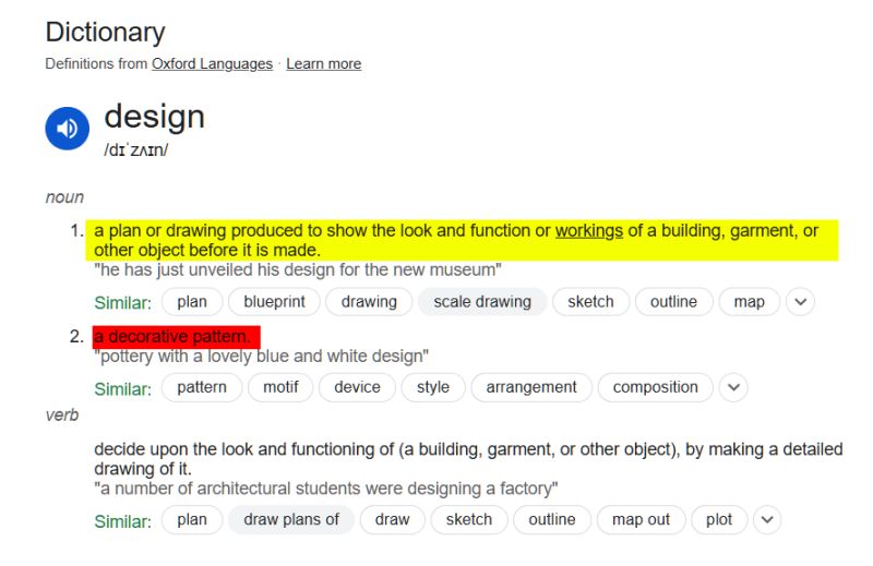
🔴 Stop treating dashboard design as a decorative pattern.
🔴 Stop googling “How to design a beautiful background for a dashboard?”
🟢 Treat a dashboard as a system.
🟢 Approach dashboard design as system design—the process of defining the architecture, components, interfaces, and data to meet specific requirements.
🟢 Design the system:
➡️ Design the data: the semantic model and DAX, the data included into the dashboard components. What data points were included and why? How that helps to improve the entire system?
➡️ Design the components: visuals (and their subcomponents), slicers, buttons, etc. Remember, “design” is not just about appearance (graphic design). It’s about why each component is needed and how it works.
Remember, your “beautiful background” is just one component, and it doesn’t necessarily make the dashboard (the system) more effective or efficient.
➡️ Design the architecture: the relationships between all components and the data behind the components.
➡️ Design the user interface and user experience (UI/UX). How the system interacts with the users?
And don’t forget: that’s the system. Components, their relationships, and interactions with users are all parts of the whole and depend on each other. You can’t design the dashboard layout (background) first, then design charts and insert them into the existing layout, and only then start thinking about user experience.
🟢 Create a plan for how the data should be presented and how the dashboard should function to help users reach their business goals by better understanding the data.
P.S. But I need a cool background to make the users interested in using my dashboard! If your goal is to maximize the number of dashboard viewers (and LinkedIn reactions), then yes, make it “cool” and share it widely.
However, if your goal is to help specific stakeholders achieve their objectives, focus on showcasing the key messages in the data—such as important trends or patterns. A simple bar chart with a white background will be more effective for this purpose than a “beautiful” background and N meaningless charts added to the dashboard because the “beautiful dashboard template design” had placeholders for N charts.