Power BI Report Refresh Performance Analyzer
To understand why a Power BI report refresh takes too much time, we can use SQL Server Profiler. SQL Server Profiler can be connected to a Power BI report in Power BI Service (must be in a Premium workspace) using XMLA Endpoints. Read Connecting SQL Server Profiler to Power BI Premium by Chris Webb and for more details.
It can also be connected to a Power BI report in Power BI Desktop. The easiest way is to add a button to the External Tools toolbar. Download https://github.com/avatorl/PowerBI/blob/main/performance/sqlserverprofiler.pbitool.json, put it into the C:\Program Files (x86)\Common Files\Microsoft Shared\Power BI Desktop\External Tools folder, then open Power BI.

The problem is that an SQL Server Profiler trace is not easy to analyze as is.

Look at the above table and try to answer the following questions: Which queries take more time to refresh? Are queries being refreshed simultaneously? How do Power BI report options, such as Parallel loading of tables, affect the refresh?

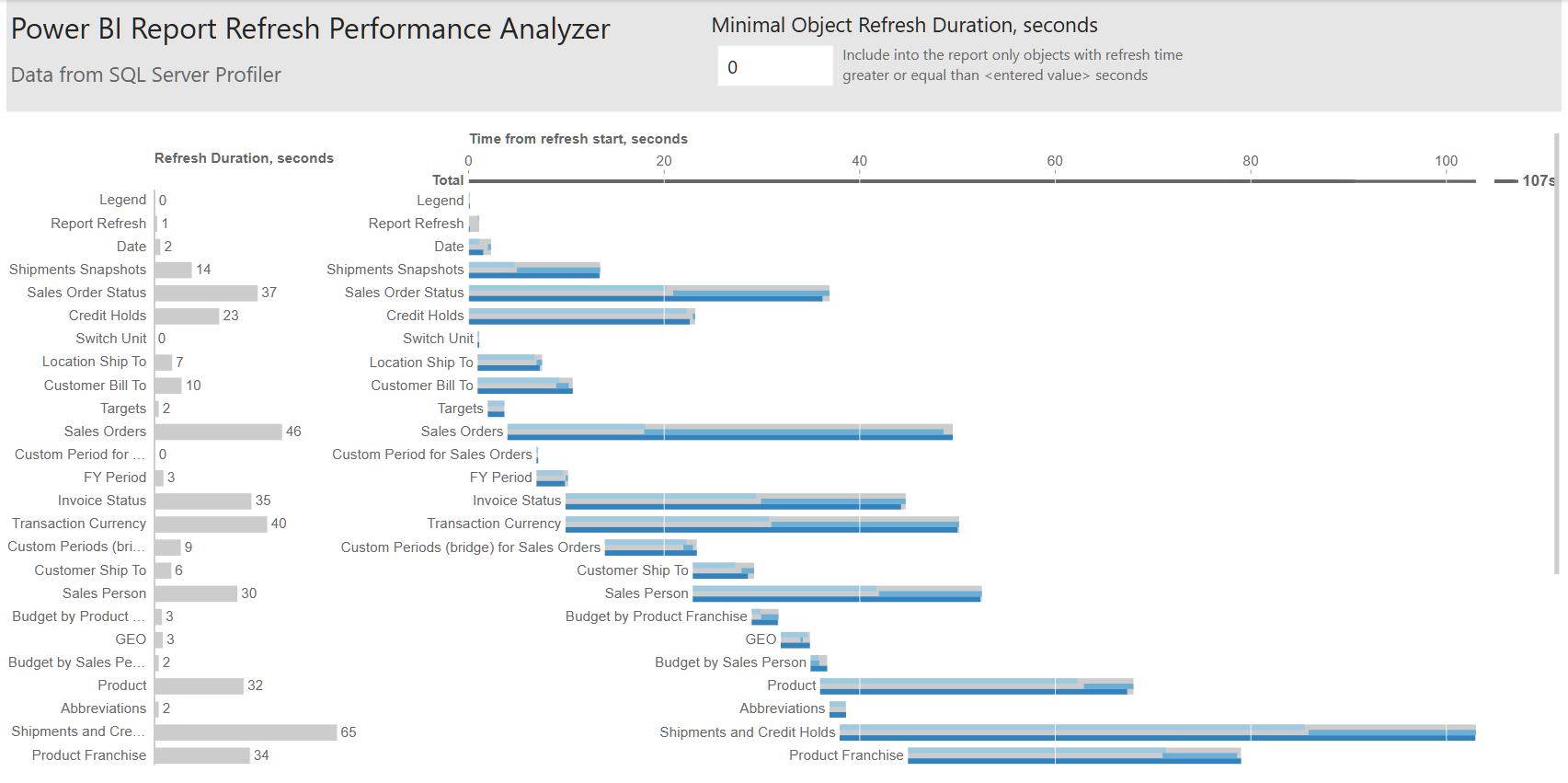
It would be helpful to visualize the trace. Since data visualization is our passion and our data visualization tool is Power BI, I created the Power BI Report Refresh Performance Analyzer.pbit Power BI report template.
Export the SQL Server Profiler trace into an XML file:

Then open the report template and enter the path to the Trace XML file.

Now you can see what is happening during the Power BI report refresh. The report shows a bar chart with the refresh duration for each object (tables, in some cases – columns), as well as a Gantt chart with the relative refresh time (relative to the refresh start).

You can change the “Minimal Object Refresh Duration, seconds” parameter to exclude small objects that take less than the entered value in seconds to refresh.

You can try report refreshing with different Data Load options and export multiple SQL Server Profiler traces.


The examples in this post have been created using Custom = 6 value.
2024-07-06 UPDATE
I’ve read Visualise your Power BI Refresh, realized what is missing and added 2 more columns. Thanks to Phil Seamark.
Rows Loaded – number of rows loaded into the table
Time to load 1K rows, s – time to load 1K rows (only for tables with 1K+ rows that take more than 1s to load)
Power BI Report Refresh Performance Analyzer.pbit Power BI report template
