IBCS and data labeling in interactive Power BI reports
International Business Communication Standards (https://www.ibcs.com/ibcs-standards-1-2/) recommends:
"Numbers with more than three digits in charts and four digits in tables are hard to read; moreover, such precision is seldom necessary to understand the message." IBCS 1.2 SI 5.2 Avoid long numbers
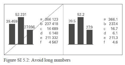
Instead of a “12,345,678.98” data label, use a “12.3” (million) data label. Opting for a shorter data label can significantly enhance the readability and effectiveness of a chart. Focus on the most relevant magnitude of the data to facilitate quicker comprehension and comparison.
The detail of the remaining 45,678.98, which constitutes a mere 0.37% of the precise value, might be considered negligible. In scenarios where the trends and patterns are more critical than the absolute precision of each data point, such rounding is not only acceptable but advisable. It prevents information overload and keeps the audience’s attention on the broader insights the chart intends to convey.
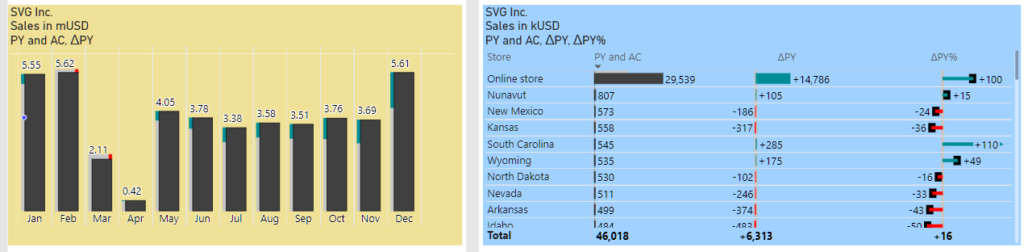
But what about dynamic datasets and interactive reports? The content fluctuates, and charts are subject to variation through user interactions like filtering, slicing, or cross-filtering. This inherent variability means that the magnitude of data points can span a wide range, from thousands to millions and beyond. Power BI attempts to accommodate this diversity with its “display units = auto” feature, which automatically adjusts the unit of measurement based on the data’s scale and adds a suffix to each data label (“M” for millions, “K” for thousands). However, this feature doesn’t always deliver optimal clarity. The inclusion of unit suffixes in every label can lead to a cluttered visual space, especially when the available area for data labels is constrained. Such redundancy not only detracts from the aesthetic appeal of the chart but can also impede the readability and quick interpretation of the data. Users might find it more difficult to extract meaningful insights at a glance when each data point is appended with a potentially superfluous unit indicator.
Adding to this complexity, Power BI’s approach to abbreviating units lacks consistency, employing a mix of abbreviations like “M” for millions, but “bn” for billions. This inconsistency can further complicate the user experience, as it introduces an additional layer of variability that users must navigate.
"Use consistent currency abbreviations across an organization such as the ones suggested by ISO 4217. ISO 4217 provides a set of currency abbreviations using three-letter acronyms such as EUR, CHF, USD, and GBP. The use of special currency symbols such as €, $, and ₤ is not recommended if a report includes many different currencies. Use also consistent metric prefixes across an organization in combination with the currency units for monetary values expressed in thousands or millions. A good option is to use lower case characters to differentiate the prefixes from the currency abbreviations and use single digit metric prefixes to save space, such as “k” for thousand, “m” for million and “b” for billion. Below are examples of using single digit currency metric prefixes with EUR: 1 kEUR = 1 000 EUR, 1 mEUR = 1 000 000 EUR, 1 bEUR = 1 000 000 000 EUR" IBCS 1.2 UN 1.2 Unify numbers, units and dates
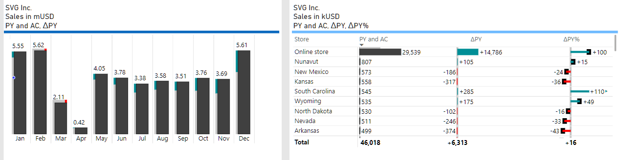
Sounds good, but the “mUSD” label is even longer than just “M” To avoid the issue of redundant labeling, incorporating “mUSD” into the chart’s title offers a more elegant solution. This strategy ensures the necessary context of the data’s unit of measurement is maintained without compromising the aesthetic and functional simplicity of the chart. By adopting this approach, viewers are immediately informed about the unit scale applicable to all data points in the chart, eliminating the need for repetitive labels and thereby improving the overall effectiveness and user experience of the data visualization.
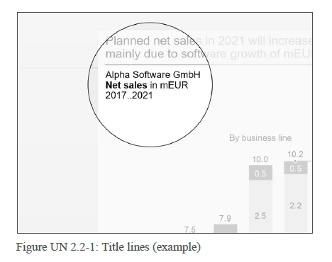
"Title line 2: Business measure(s) ("what"). Element(s) of the measure dimension such as sales, profit, and shipment. Business measures are measured either in currency units (e.g. EUR, USD) or in physical units (e.g. #, kg, t). Use metric prefixes (e.g. k, m, b for monetary values) where appropriate. Measures are written in bold font, their units are written in regular font. Examples are: Net sales in mEUR, Net sales in mEUR, margin in %" IBCS 1.2 UN 2.2 Unify titles and subtitles
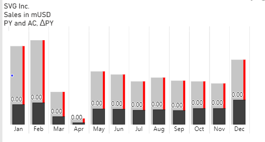
By incorporating “mUSD” into the chart title and consistently showing values in millions without adding the “M” suffix, we’ve simplified the presentation of data labels to clear figures like “12.3”. However, when the chart is subject to cross-filtering, the labels can sometimes appear as “0.00”. This indicates a loss of data granularity, where values too small to be expressed in millions effectively round down to zero. Consequently, the usefulness of cross-filtering for uncovering detailed data insights is diminished, leading to concerns about the suitability of a fixed million-unit representation in all scenarios. The challenge involves finding a balance between ensuring a clean, legible chart and retaining the ability to detect subtle data variations when using interactive filters.
The need to adjust the multiplier and dynamically switch between “mUSD” and “kUSD” in the chart’s title presents a challenge in keeping consistency and clarity for the user. Constantly changing multipliers can cause confusion, as users might not quickly understand the current scale of the data being displayed.
To reduce potential confusion, implementing design strategies that support understanding is crucial. Using consistent visual cues and scale indicators across charts can help users adapt to dynamic scaling. Making sure these aids are intuitive and minimally intrusive will improve the user experience by making the data more accessible and the insights clearer.
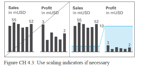
"Things that doesn't mean the same must not look the same. The different scaling of the two charts must be visually recognizable so we won't be tempted to compare their values" , Rolf HichertJürgen FaisstSolid, outlined, hatched: How visual consistency helps better understand reports, presentations and dashboards.
"There are several ways to overcome challenging scaling problems. Scaling indicators, such as scale bands indicating the same numerical height (typically a power of 10) in all charts are helpful to assist in comparing multiple charts (of the same unit) with different scales." IBCS 1.2 CH 4.3 Use scaling indicators if necessary
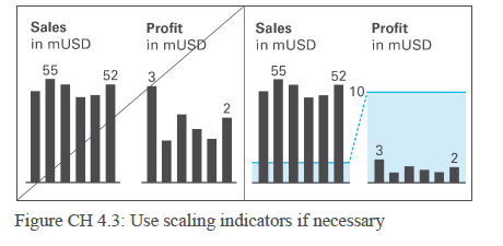
Rolf Hichert and Jürgen Faisst in their book, “Solid, Outlined, Hatched: How Visual Consistency Helps Better Understand Reports, Presentations, and Dashboards,” suggest additional scaling aids such as varied colors, opacity levels, and symbols to enhance comprehension.
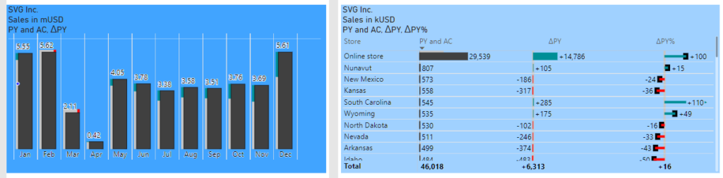
We can fill the chart area (or a part of it) with different colors to mark charts with different unit multipliers (e.g., mUSD vs. kUSD).
Differentiating unit multipliers like mUSD and kUSD with colors can improve visual clarity when used judiciously. However, the success of this method largely hinges on the user’s ability to recognize what each color signifies. Without an explicit legend to decode the color scheme, users might find this approach more confusing than beneficial. Moreover, overreliance on color variations just to denote unit multipliers might lead to a visually cluttered report, potentially overshadowing the data itself.
We can fill the chart area (or a part of it) with the same color but with different opacity levels. Filling the entire chart area, as in the previous example, still increases visual clutter.
But which part of the Power BI visual can be used to denote unit multipliers?
There is a relatively new and somewhat redundant feature in Power BI visuals – the Divider (situated between the chart title and chart plot). This could be the most effective solution that can be easily implemented and will work consistently across all Power BI visuals. The bluish divider appears to be much more visible than “mUSD” or “kUSD” in a three-line title, yet it is not too distracting at the same time. I would suggest, for example, a grey line for a multiplier of 1 (USD), a light blue line for a multiplier of 1,000 (kUSD), and a darker blue line for a multiplier of 1,000,000 (mUSD).
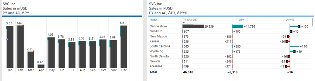
This method of utilizing the Divider not only enhances the interpretability of the data but also maintains a clean aesthetic, ensuring that the focus remains firmly on the insights conveyed by the chart.
In addition to employing the Divider, integrating symbols, lines and areas within the chart itself serves as an effective strategy for highlighting scaling variations. These in-chart elements reflect changes in scale directly on the graph, providing an immediate visual cue that enhances the viewer’s comprehension of the data’s magnitude.
However, the Divider solution can offer a concise overview of the scaling applied throughout the entire report page. This approach has also the distinct advantage of being universally applicable across various Power BI visuals, ensuring a seamless integration without the need for extensive customization.