Use interactivity and animation to guide report users
While explanatory reports should be intuitively easy to understand without any legends and tutorials, tools for data exploration may benefit from some complexity and therefore from additional visual layers and interactivity intendent to teach and guide a user.
For example,
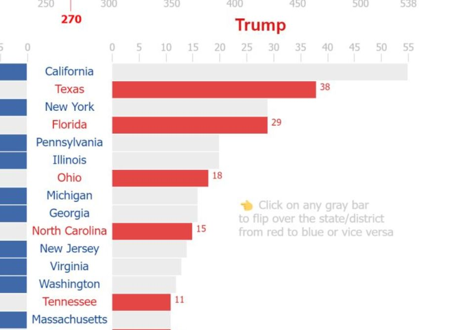
This Vega chart is interactive and allows a user to check how the election result would like if some states will flip over from one candidate to another. How to let user know that the chart is interactive?
“Click on any gray bar to flip over the stare/district from red to blue or vice versa” label can be visible (in front of one of the gray bars):
1) always
2) limited amount of time (e.g. first 30 seconds)
3) until the user clicks on any gray bar for a first time
4) until either 2) or 3), whatever happens first
In more complicated report it’s possible to implement:
1) “?” toggle button that shows/hides multiple additional labels, legends etc.
2) an animation (not a pre-recorded video) that animates the visualization (or its parts) to show a user what is clickable, draggable etc.
3) RLS can be used to show additional visual layers by default to users in a certain user group (e.g. “newbies”) and to hide them by default for more experienced users. Or we can disable certain advanced features for the “newbies” user group.
In Power BI some of this options can be implemented when only Power BI core visuals used, other require Deneb/Vega based dashboard. Maximal flexibility is possible when the entire dashboard is based on a single Deneb/Vega visual.