Florence Nightingale’s Rose Diagram
Florence Nightingale (12 May 1820 – 13 August 1910) was an English social reformer, statistician, and the founder of modern nursing. She gained prominence while serving as a manager and trainer of nurses during the Crimean War, where she organized care for wounded soldiers in Constantinople. By improving hygiene and living conditions, she significantly reduced death rates.

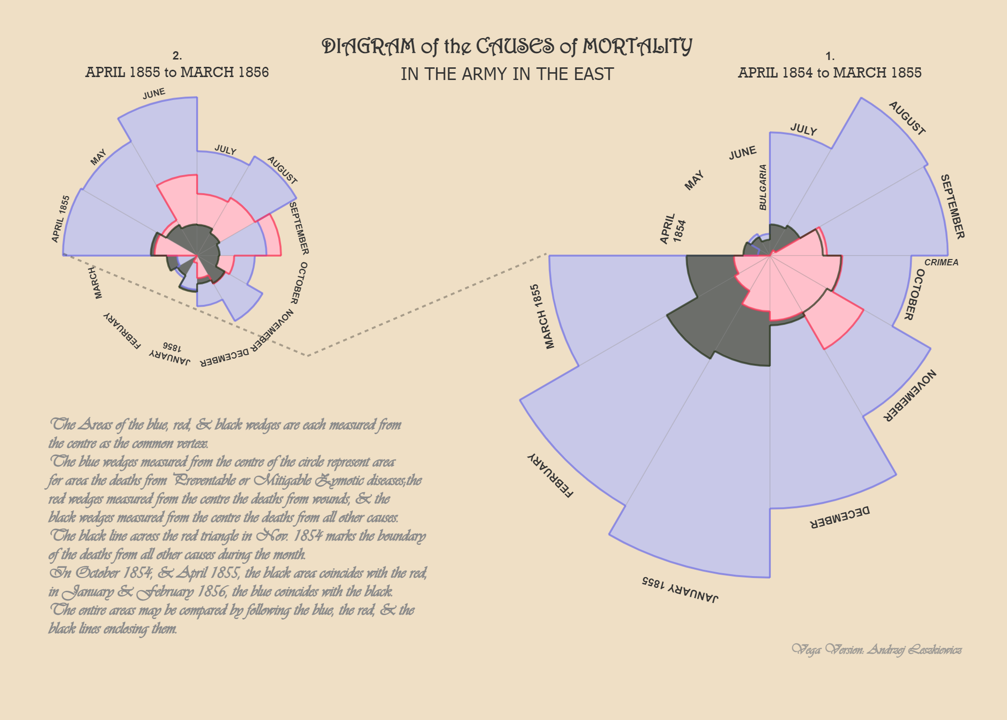
Nightingale was a pioneer in the field of statistics. She presented her analyses in graphical forms to facilitate the drawing of actionable conclusions from data. She is renowned for her use of the polar area diagram, which is akin to a modern circular histogram. [Wikipedia: Florence Nightingale]
The diagram originally was published in 1958 in a privately printed work and then in 1959 in “A Contribution to the the Sanitary History of the British Army During the Late War with Russia“.
The diagram showed that epidemic diseases, which were responsible for more British deaths in the course of the Crimean War than battlefield wounds, could be controlled by a variety of factors including nutrition, ventilation, and shelter. The graphic, which Nightingale used as a way to explain complex statistics simply, clearly, and persuasively, has become known as Nightingale’s Rose Diagram.
I reproduced this chart using Vega:
Source code: https://github.com/avatorl/Deneb-Vega/tree/main/nightingale-rose
Scroll down the page to see how I built the chart. But first I’m going to describe what interesting differences have become noticeable between the original and the reproduction.
What is wrong (or just different)
A few things are different between the original chart and my Vega version (and I’m talking about data driven differences, not about formatting like fonts and colors).
| Month, Year | What is wrong (strange) on the Nightingale’s chart. Possible causes. |
| April 1854 | Blue outer line is not visible. Probably to small to draw. |
| May 1854 | Blue sector looks greater than black sector for April 1854. Probably drawing error because of the small size. |
| September 1854 | Red sector is smaller than black, but data say otherwise. Probably drawing mistake. |
| January 1855 | While all other segments are almost identical between the original and Vega version (any difference can be explained with manual drawing errors), Blue segment for this months looks exaggerated. |
| Chart 1 Overall | It looks like the layering rule was: blue layer, then black on the top, then red on the top and therefore black sector for November 1854 is behind red sector. Why not “smaller sector is on the top of larger”? Why not the same rule for Chart 2? What reasoning stands behind the decision? Was it an arbitrary decision? |
| October 1855 | Red segment is smaller than it should be. Probably drawing error because of the small size. |
| November 1855 | Red segment is smaller than it should be (should be almost identical with black). Drawing mistake? |
| December 1855 | Red segment is smaller than it should be (almost invisible). Drawing mistake? |
| January 1856 | Blue is not visible. It almost identical with black. Arbitrary decision to draw black on top of blue? On Vega version blue is on the top because it’s a little bit smaller than black. |
| February 1856 | Blue is not visible. Arbitrary decision to draw black on top of blue? On Vega version black is on the top because it’s a little bit smaller than blue. |
| April 1856 | Red is not visible. Arbitrary decision to draw black on top of red? On Vega version red is on the top because it’s a little bit smaller than black. |
| Chart 2 Overall | What was the rule? Why not “smaller sector is on top of larger sector”? |
The above facts probably doesn’t change overall message the chart was designed to send, but it was interesting to find that the chart is not as straightforward as it looks like and an attempt to reproduce it highlights the mistakes/errors/arbitrary decisions made when the chart was created.
How I built the chart
First step is to get original data. I found the tables in two sources, in the book mentioned on the above (together with the chart) and in Mortality of the British army : at home and abroad, and during the Russian war, as compared with the mortality of the civil population in England ; illustrated by tables and diagrams.
This is the data table in CSV in my Github repository. I entered only annual rate of mortality per 1000 part of the table, because this is what was used to build the diagram.
Parsing the data from CSV file into a table in Vega:
    {
      "name": "dataset-csv",
      "url": "https://raw.githubusercontent.com/avatorl/Deneb-Vega/main/nightingale-rose/nightingale-rose-data.csv",
      "format": {"type": "csv", "parse": "auto", "delimiter": ","}
    },
Adding id1 and id2 columns and Chart column. id1 column contains numbers from 1 to 24 (all rows in the table), id2 refers to id1 of the previous month (as displayed on the chart, e.g. April 1854 goes right after March 1855). Chart column contains 1 for first 12 rows and 2 for the rest 12 rows (to split data between two chart):
   {
      "name": "dataset",
      "source": "dataset-csv",
      "transform": [
        {"type": "identifier", "as": "id1"},
        {
          "type": "formula",
          "as": "id2",
          "expr": "datum.id1==1||datum.id1==13?datum.id1+12-1:datum.id1-1"
        },
        {"type": "formula", "as": "Chart", "expr": "datum.id1<=12?1:2"}
      ]
    },
Then I have added Disease2, Wounds2 and Other2 values – mortality because of Diseases, Wounds and Other reasons in the previous month (as displayed on the chart, e.g. April 1854 goes right after March 1855). This why I needed id1 and id2 columns.
   {
      "name": "dataset2",
      "source": "dataset",
      "transform": [
        {
          "type": "lookup",
          "from": "dataset",
          "key": "id1",
          "fields": ["id2"],
          "values": ["Diseases", "Wounds", "Other"],
          "as": ["Diseases2", "Wounds2", "Other2"]
        }
      ]
    },
Then I’m splitting the dataset2 table in two (by previously added Chart column), calculating starting and ending angles (in radians) of each sector (using “pie” data transformation type) and combining the tables back into a single table:
  {
      "name": "dataset-chart-1",
      "source": "dataset2",
      "transform": [
        {"type": "filter", "expr": "datum.Chart==1"},
        {
          "type": "pie",
          "startAngle": {"signal": "-PI/2"},
          "endAngle": {"signal": "2*PI-PI/2"}
        }
      ]
    },
    {
      "name": "dataset-chart-2",
      "source": "dataset2",
      "transform": [
        {"type": "filter", "expr": "datum.Chart==2"},
        {
          "type": "pie",
          "startAngle": {"signal": "-PI/2"},
          "endAngle": {"signal": "2*PI-PI/2"}
        }
      ]
    },
    {
      "name": "dataset-combined",
      "source": ["dataset-chart-2", "dataset-chart-1"]
    }

Final “dataset-combined” table is what will be used to render both charts.
The chart is using square-root based scale “scaleRadius”:
  "scales": [
    {
      "name": "scaleRadius",
      "type": "sqrt",
      "domain": {
        "data": "dataset-combined",
        "fields": ["Diseases", "Wounds", "Other"]
      },
      "zero": true,
      "range": [0, {"signal": "radius"}]
    }
  ],
Chart title and subtitle:

  "title": {
    "text": "DIAGRAM of the CAUSES of MORTALITY",
    "dy": 70,
    "color": {"signal": "colorChartTitles"},
    "font": {"signal": "fontTitle"},
    "fontSize": {"signal": "facsimileOpacity==1?0:21"},
    "subtitle": "IN THE ARMY IN THE EAST",
    "subtitleColor": {"signal": "colorChartTitles"},
    "subtitleFont": {"signal": "fontSubtitle"},
    "subtitleFontSize": {"signal": "facsimileOpacity==1?0:18"},
    "subtitleFontWeight": "lighter",
    "subtitlePadding": 10
  },
The following part of the code creates 2 cells (columns) for two charts and creates “dataset-year” facet (using previously created “Chart” column) with part of the data required for each of the charts:
    {
      "type": "group",
      "layout": {
        "align": "all",
        "columns": {"signal": "2"},
        "padding": {"signal": "125"}
      },
      "marks": [
        {
          "type": "group",
          "from": {
            "facet": {
              "name": "dataset-year",
              "data": "dataset-combined",
              "groupby": "Chart"
            }
          },
The main building block is an “arc” mark. We need 3 of them (“arc-layer-1”, “arc-layer-2”, “”arc-layer-3”) for 3 layers of the sectors (3 causes of mortality). This is where I have found that some arbitrary decisions where made by Florence Nightingale. On the first chart (one on the right side) it looks like Deseases (blue color) segments are always on the first (bottom) layer, then Wounds (red color) layer and Other causes (black color). This what datum.Chart==1? condition does, it makes sure that for Chart 1 first (bottom) layers is for Deseases (blue color).
For Chart 2 it’s a bit different approach – largest value (among Deseases, Wounds and Other) goes on the first (bottom) layer.

          {
              "type": "arc",
              "name": "arc-layer-1",
              "from": {"data": "dataset-year"},
              "encode": {
                "enter": {
                  "x": {"signal": "positionX"},
                  "y": {"signal": "positionY"},
                  "startAngle": {"signal": "datum.startAngle"},
                  "endAngle": {"signal": "datum.endAngle"},
                  "innerRadius": {"value": 0},
                  "outerRadius": {
                    "scale": "scaleRadius",
                    "signal": "datum.Chart==1?datum.Diseases:max(datum.Diseases,datum.Wounds,datum.Other)"
                  },
                  "stroke": {"value": "gray"},
                  "strokeOpacity": {"value": 0.2},
                  "fill": {
                    "signal": "datum.Chart==1?colorBlue:(datum.Diseases>datum.Wounds&&datum.Diseases>datum.Other)?colorBlue:(datum.Wounds>datum.Diseases&&datum.Wounds>datum.Other)?colorPink:colorBlack"
                  },
                  "fillOpacity": {"value": 1}
                }
              }
            },
It’s very similar for next 2 layers (“arc-layer-2” and “arc-layer-3”). Second layer is for Wounds on Chart 1 and for the middle value on Chart 2. Third layer if for others on Chart 1 and for the smallest value on Chart 2.
The next 3 marks (“arc-layer-1-outline”, “arc-layer-2-outline”, “arc-layer-2-outline”) are used to draw an outer arc of each sector (for Deseases, Wounds and Other causes):

        {
              "type": "arc",
              "name": "arc-layer-1-outline",
              "from": {"data": "dataset-year"},
              "encode": {
                "enter": {
                  "x": {"signal": "positionX"},
                  "y": {"signal": "positionY"},
                  "startAngle": {"signal": "datum.startAngle"},
                  "endAngle": {"signal": "datum.endAngle"},
                  "innerRadius": {
                    "scale": "scaleRadius",
                    "signal": "datum.Diseases"
                  },
                  "outerRadius": {
                    "scale": "scaleRadius",
                    "signal": "datum.Diseases"
                  },
                  "strokeOpacity": {"signal": "strokeOpacityOutline"},
                  "strokeWidth": {"signal": "strokeWidthOutline"},
                  "stroke": {"signal": "colorBlueOutline"}
                }
              }
            },
The next 3 marks (“arc-layer-1-radial”, “arc-layer-2-radial”, “arc-layer-2-radial”) are used to connect the arcs created earlier with radial lines.
           {
              "type": "arc",
              "name": "arc-layer-1-radial",
              "from": {"data": "dataset-year"},
              "encode": {
                "enter": {
                  "x": {"signal": "positionX"},
                  "y": {"signal": "positionY"},
                  "startAngle": {"signal": "datum.startAngle"},
                  "endAngle": {"signal": "datum.startAngle"},
                  "innerRadius": {
                    "scale": "scaleRadius",
                    "signal": "datum.Diseases"
                  },
                  "outerRadius": {
                    "scale": "scaleRadius",
                    "signal": "datum.Diseases2"
                  },
                  "strokeOpacity": {"signal": "strokeOpacityOutline"},
                  "strokeWidth": {"signal": "strokeWidthOutline"},
                  "stroke": {"signal": "colorBlueOutline"}
                }
              }
            },
A “text” mark adds month names (and for certain months also a year):

         {
              "type": "text",
              "name": "text-month",
              "from": {"data": "dataset-year"},
              "encode": {
                "enter": {
                  "fontSize": {"signal": "datum.Chart==1?11:9"},
                  "x": {"signal": "positionX"},
                  "y": {"signal": "positionY"},
                  "radius": {
                    "scale": "scaleRadius",
                    "signal": "pow(datum.Diseases,1/0.98)<110?110:pow(datum.Diseases,1/0.98)"
                  },
                  "theta": {"signal": "(datum.startAngle + datum.endAngle)/2"},
                  "angle": {
                    "signal": "360*(datum.startAngle+(datum.endAngle-datum.startAngle)/2)/2/PI"
                  },
                  "fill": {"signal": "colorLabels"},
                  "fontWeight": {"value": "bolder"},
                  "align": {"value": "center"},
                  "baseline": {"value": "middle"},
                  "lineBreak": {"value": "\n"},
                  "text": {
                    "signal": "(datum.Year==1854&&datum.Month=='April')?upper(datum.Month)+'\\n'+datum.Year:(datum.Year==1855&&datum.Month=='March')?upper(datum.Month)+' '+datum.Year:(datum.Year==1856&&datum.Month=='January')?upper(datum.Month)+'\\n'+datum.Year:(datum.Year==1855&&(datum.Month=='April'||datum.Month=='January'))?upper(datum.Month)+' '+datum.Year:upper(datum.Month)"
                  }
                }
              }
            }
One more “text” mark “text-location” I used to add “Bulgaria” and “Crimea” labels (Chart 1).

“rule-years-connector1” and “rule-years-connector2” “rule” marks are to draw a line that connects two charts (last month of Chart 1 with first month of Chart 2).

    {
      "type": "rule",
      "name": "rule-years-connector1",
      "encode": {
        "enter": {
          "opacity": {"signal": "0.3"},
          "strokeWidth": {"signal": "2"},
          "strokeDash": {"signal": "[1,0,3]"},
          "x": {"signal": "-145"},
          "y": {"signal": "10"},
          "x2": {"signal": "105"},
          "y2": {"signal": "115"}
        }
      }
    },
“text-description” “text” mark is for the long text description.

   {
      "type": "text",
      "name": "text-description",
      "encode": {
        "enter": {
          "fill": {"signal": "colorText"},
          "opacity": {"value": 1},
          "font": {"signal": "fontText"},
          "fontSize": {"value": 18},
          "fontWeight": {"value": "bolder"},
          "x": {"signal": "-width*0.4"},
          "y": {"value": 190},
          "width": {"value": 110},
          "lineBreak": {"value": "\n"},
          "lineHeight": {"value": 19},
          "text": {
            "value": "The Areas of the blue, red, & black wedges are each measured from\nthe centre as the common vertex.\nThe blue wedges measured from the centre of the circle represent area\nfor area the deaths from Preventable or Mitigable Zymotic Diseases;the\n   red wedges measured from the centre the deaths from wounds, & the\n   black wedges measured from the centre the deaths from all other causes.\nThe black line across the red triangle in Nov. 1854 marks the boundary\n   of the deaths from all other causes during the month.\nIn October 1854, & April 1855, the black area coincides with the red,\n   in January & February 1856, the blue coincides with the black.\nThe entire areas may be compared by following the blue, the red, & the\n   black lines enclosing them."
          }
        }
      }
    },
“text-author” “text” mark is for my name.

    {
      "type": "text",
      "name": "text-author",
      "encode": {
        "enter": {
          "fill": {"signal": "colorText"},
          "opacity": {"value": 0.8},
          "font": {"signal": "fontText"},
          "fontSize": {"value": 14},
          "fontWeight": {"value": "bolder"},
          "x": {"signal": "600"},
          "y": {"value": 420},
          "width": {"value": 110},
          "lineBreak": {"value": "\n"},
          "text": {"value": "Vega Version: Andrzej Leszkiewicz"}
        }
      }
    },
“text-helper” “text” mark is for the red text that tells that a chart is clickable.

   {
      "type": "text",
      "name": "text-helper",
      "encode": {
        "enter": {
          "align": {"value": "center"},
          "baseline": {"value": "top"},
          "x": {"signal": "300"},
          "y": {"signal": "-140"},
          "fill": {"signal": "'red'"},
          "opacity": {"value": 0.7},
          "font": {"signal": "fontSubtitle2"},
          "fontWeight": {"value": "lighter"},
          "lineBreak": {"value": "\n"},
          "text": {
            "value": "Click anywere on the chart to switch between \nthe original chart and the reproduction"
          }
        },
        "update": {"fontSize": {"signal": "clicks<2?14:0"}}
      }
“image-facsimile” “image” mark is for the image (facsimile) of the original chart.
  {
      "type": "image",
      "name": "image-facsimile",
      "encode": {
        "enter": {
          "url": {"signal": "facsimileUrl"},
          "x": {"signal": "-width/2"},
          "y": {"signal": "-height/2-30"}
        },
        "update": {"opacity": {"signal": "facsimileOpacity"}}
      }
    },
For interactivity I used 2 signals. One to change facsimile (original chart) opacity between 0 and 1 after each click on the chart area (“view”). And one to hide “text-helper” text after first 2 clicks.
   {
      "name": "facsimileOpacity",
      "value": 0,
      "on": [
        {
          "events": {"source": "view", "type": "click"},
          "update": "1-fascimileOpacity"
        }
      ]
    },
    {
      "name": "clicks",
      "value": 0,
      "on": [
        {"events": {"source": "view", "type": "click"}, "update": "clicks+1"}
      ]
    },
To make the chart as much as possible similar to the original I had to play with “x”, “y”, “dx”, “dy” attributes of the marks to make sure each visual elements located in (almost) the same palce as on the original chart.
This Vega visualization uses non-standard fonts. If you don’t have Harrington, Rockwell, Vivaldi fonts installed, then the titles, subtitles, text will look differently. Install the fonts, use other fonts or use @font-face CSS rule (when embedding Vega code into a web page).