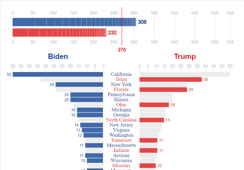
US Presidential Election Results 2020 Chart
After all the struggle with native Power BI visuals (their limitations) Deneb-Vega gives you a real power. Probably for someone who worked with JavaScript from the beginning it’s nothing special, but for a Power BI developer it’s a whole new world inside of Power BI. Highly customizable and interactive world of data visualization.
I wanted to build this chart in 2020 during the US elections, but I had no tool (inside of Power BI) and knowledge (Vega) to achieve required conditional formatting and interactivity. Now I can build highly customized and highly interactive charts in Power BI. And what is great, it’s possible to publish the same chart on the web without Power BI.
The charts show the elections result, but also allows a user to flip states/districts (by clicking on a gray horizontal bar) to see how different result in this state/district could affect the overall result. The chart could be very useful during the vote counting, when most results are already known, but a few states/districts are still counting the votes. But I have missed the 2020 elections and made the chart 2 years later. Well, soon it will be useful again.
Also it’s a great showcase of a good data visualization and a great showcase of Deneb-Vega possibilities.
See Vega code in my Github repository https://github.com/avatorl/Deneb-Vega/tree/main/US%20Elections%20Chart