Power BI: advanced Radar Charts using Deneb-Vega
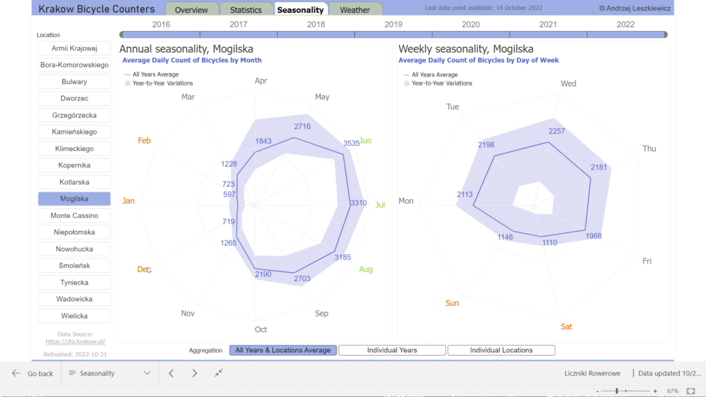
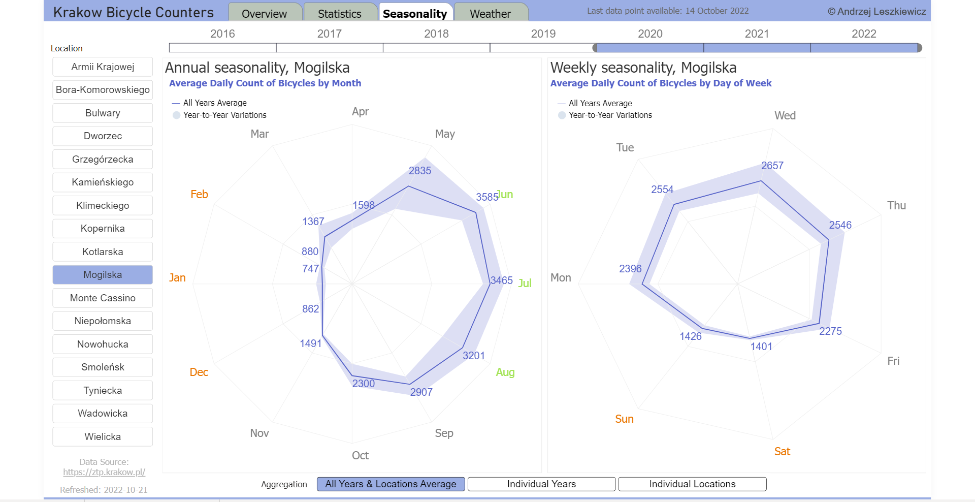
After some experiments I have just published new version of the Seasonality page of my experimental showcase Krakow Bicycle Counters report.
Also I’ve shared the Vega code I wrote for this two radar charts.
What I have built is more than just a simple radar chart.
A single visual allows to show data in two different ways:
1) average line + filled area to show all the variations
2) a line for each series (either each year or each location)
And a single chart supports 3 different levels of data aggregation:
1) average for all years and locations
2) individual years (average for all selected locations)
3) individual locations (average for all selected years)
Vega allows to transform (regroup) data as needed on the fly and it makes re-aggregation possible.
I’m still planning to make some changes, it’s an experimental report and it’s far from being perfect, but the core functionality of the radar charts will remain.
I also tried to use internal Vega inputs (radio buttons) for the aggregation levels switch, but they have no formatting options and on a Power BI page they behave not in the way I needed. Therefore I finally used an external (Power BI visual) slicer. I think Vega inputs is the only thing I don’t like in Vega. Vega (when used on a web page) can use external input elements defined outside of the Vega JSON code. But this is not what works in Power BI where Vega chart is isolated within Deneb visual. Therefore, for the cases when Vega input elements doesn’t work as expected and can’t be formatted as desired the only good option is to use Power BI slicers. But in other case Vega inputs can be useful, I’ll need to find a good showcase.