Map with Pie Charts?
In Add a pie chart layer Azure documentation article you will learn how to add a pie chart layer to an Azure Maps Power BI visual.
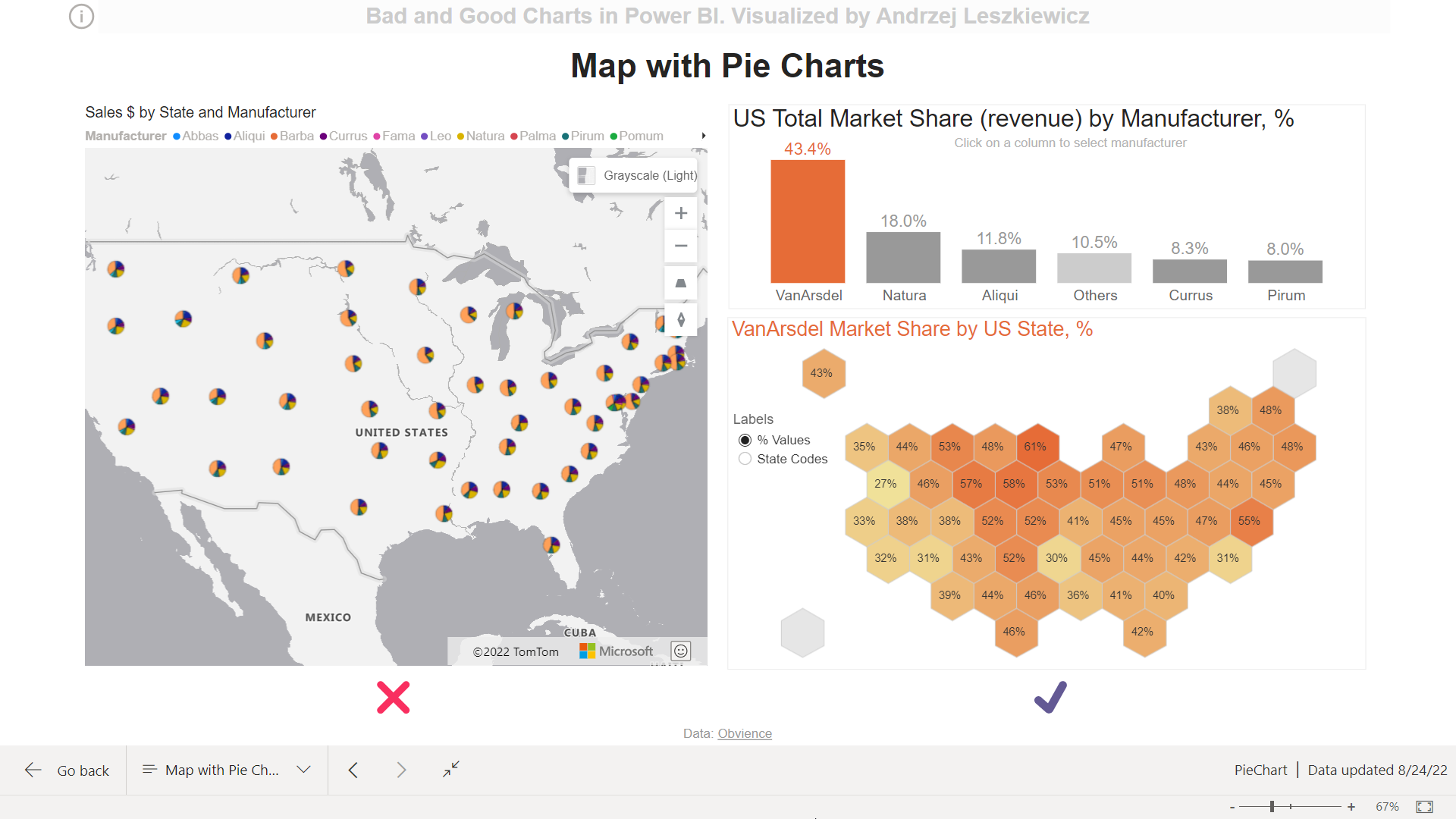
In this blog post you will learn that there are much better alternatives than adding pie charts to a map visual. Pie chart as a chart type is not bad, a pie chart in wrong context and with wrong formatting is bad. 50 small pie charts in a wrong place with wrong formatting are really bad. By “they are bad” I mean they are very ineffective and probably misleading. Look at the map on the left.
Live Power BI report:
Do you see any patterns? Now look at the cartogram on the right. Is it better now? Also by switching between the top manufacturers (columns on the column chart are clickable) you can see regional patterns for each of the top 5 manufacturers (and for all the others combined).
There is no single answer to what is a “good chart”, but for sure the chart on the right is much better if you’re looking for some regional/state level patterns.
How did I build this better chart?
First of all, there were decisions to make. We are looking for answers to the question how multiple manufacturers are presented in different US states by their market share (% of revenue) and to many more specific questions. Did we sell mostly VanArsdel products in every US state? Did we sell more Natura products than VanArsdel products in some states? Did we sell more Pirum products in the western US? There are many questions like this too answer. But I assume that in this task first of all we’re interested in analyzing brans with the largest market share. Therefore I decided to include only top 5 brands into the good chart with all other brands combined into “Others” group.
Now it is good to understand US total market shares before starting looking for regional and state level patterns. This is one of the reasons I added a column chart. And while in many cases I would prefer horizontal bars for comparison, in this case available page space and US map shape boosted me to use vertical bars.
Another reason for the column chart to be used is that it can be used as a slicer to filter the cartogram. The problem is I don’t like native behavior of the chart when using it as a slicer for this task. I want to be able to control inactive bars formatting (to make them gray) and active bar formatting (gray “Others” column has to become orange when selected). I want to be able to select the first (largest) column by default. I want to be sure my selection remains until I clicked on another column. I want to be able to click on the blank space above a smaller column to select the column without precise cursor targeting.

How I solved the problem? There is a fixed number of columns, therefore it was easy to cover them with transparent shapes.

Knowing number of the selected columns I can use it in a measure to get a name of the selected brand (columns are always sorted in descending order).
Knowing the name of the brand I now can display market share of this brand on the cartogram (read more about cartograms in Shape Map post). As well as I can apply custom conditional formatting to the columns.
One more thing I added is a slicer with “% Values” and “State Codes” items. Depends on what item is selected the cartogram displays either % values (market share) or state codes:


Hexagon colors always represent % value (market share).
Also I added a simple custom tooltip:

Now on the right side of the report page we can see US total market shares, regional patterns and state level market shares. While the chart on the left shows off a very ineffective (if not useless) Power BI (Azure Maps) feature – pie charts on a map.