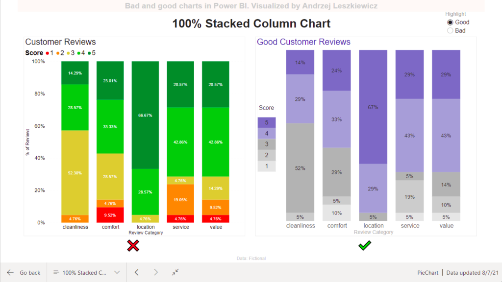
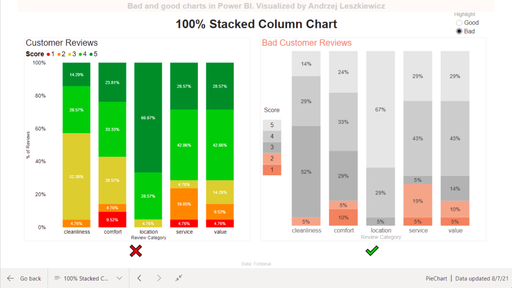
100% Stacked Column Chart – Bad and Good Charts in Power BI
One more pair of good and bad charts created in Power BI. Why the chart on the left is bad, it’s so colorful?! Color in data visualization is a very useful attribute and it should be used for a purpose. Chart on the left is indeed colorful. But what should you look into, what is more important? Green? Red? Colors bring too much distraction and nothing else. Green is good? Red is bad? So what? And what about people with color blindness?
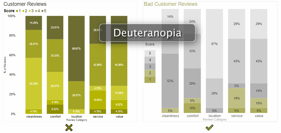
Chart on the right allows you to focus your analysis on bad or good reviews and works well for color blind people.