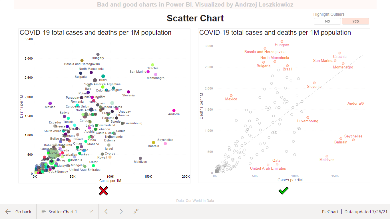
Skip to content
Power of Business Intelligence
Blog by Andrzej Leszkiewicz. Power BI Developer and Consultant.
Menu
Home (Blog)
Best Practices in Data Viz
Posts about IBCS
IBCS in Power BI (native visuals)
Bad and good charts in Power BI
Storytelling with data in Power BI
Deneb and Vega ⭐
Deneb and Vega overview
Posts about Deneb and Vega
Deneb Vega templates
Custom Vega visualizations
Deneb & Vega help
Power BI Reports 📈
Profit and loss
HR cross-function mobility
Call-center
Climate change
COVID-19
Population pyramid
Power BI Embedded
Books to Read
YouTube
About
Search for:
Search
Data Visualization
Scatter Chart
Andrzej Leszkiewicz
July 26, 2021
Share the article
Post navigation
Shape Map
The Big Picture: How to Use Data Visualization to Make Better Decisions Faster