Storytelling with data in Power BI: part 3
Storytelling with data in Power BI
Storytelling with data in Power BI: part 2
So far I have created 11 pages report (+ title page) with visuals based on all Chapter 2 exercises from “Storytelling with data. Let’s Practice.” book by Cole Nussbaumer Knaflic.
Now I’m continue to describe all report pages. This post is about page 2.2 (book exercise 2.2).
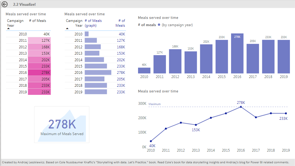
Page 2.2 is really simple. Two tables with the same data (just to show different ways to format the tables). The first table uses ‘Background color‘ conditional formatting and the second table uses ‘Data bars‘ conditional formatting. I duplicated ‘# of Meals’ column to use one column for data bars only and one column for number only. It makes numbers more readable than when same column used to show data bars and numbers.


On this page I also added a card with a stacked are chart:

Two visuals. A card with a measure to show maximal number of meals served with transparent background (white with 30% of transparency) is placed in form of stacked area chart that shows how numbers of meals served has been changing from year to year.
The stacked are chart has title, axis, data labels disabled. It shows only area.

I disabled interactions from all other visuals to both the card and the area chart. To be able to do that I moved the card to make sure interaction buttons are visible for both visuals). Once I disabled all interactions I moved the card back to cover the area chart.

On this page I also used both column chart and line chart to show how the same data (number of meals served by year) looks on different charts. But let’s talk about interactions. I clicked on column 2016 of the bar chart. It can be a table or slicer, doesn’t matter. What is important that the selection filtered other visuals on the page including line chart.
Filtered by a year line chart is just a point:

I see no sense in replacing the line with just a point when a user selected a year. With disabled interactions it looks better:

Selecting a year on the bar chart didn’t affect the line chart.
But it’s not perfect. I want to be able to highlight selected year on a line. I need to enabled interactions again to make sure my year selection affects measures I’ll be using for the line chart.
But when interactions enabled and a year selected my line chart has only one point on axis X. How to fix this?
I created a table with one column. It includes all years from the main table.
2-2 Years =ALL ( ‘2-2′[Campaign Year] )
This table should have no relationships with the main data table.
Now ‘2-2 Years'[Campaign Year] can be used for Axis X instead of ‘2-2′[Campaign Years]. Year selection based on ‘2-2′[Campaign Years] won’t affect Axis X of the line chart.
Then I created two measures.
One measure ignores ‘2-2′[Campaign Years] filter (year selection in the tabel or on the column chart):
Meals (ignore year filter) :=CALCULATE (
SUM ( ‘2-2′[Meals Served] ),
FILTER (
ALL ( ‘2-2’ ),
‘2-2′[Campaign Year] = SELECTEDVALUE ( ‘2-2 Years'[Campaign Year] )
)
)
And this measure returns number of meals served only for ‘2-2 Years'[Campaign Years] year that is equal to the selected ‘2-2′[Campaign Years] year.
Meals (selected year) :=CALCULATE (
SUM ( ‘2-2′[Meals Served] ),
FILTER (
‘2-2’,
‘2-2′[Campaign Year] = SELECTEDVALUE ( ‘2-2 Years'[Campaign Year] )
)
)
In other words, the first measure gives us a line on the chart. And the second measure gives us either a line (if we didn’t select a certain year on the bar chart) or one point – if we selected a year on the ar chart.
Then I opened Shapes formatting options, enabled Customize series and for ‘Meals (selected year’ measure I disabled the line (stroke width = 0) and enabled marker:

Done.
When no year selected on the bar chart both measures are visible on the line chart for all years (one as a line only, and one as makers only):

When a year selected on the bar chart then line is still being visible on the line chart, but only one marker is visible. The marker for the selected year.

The same will work with a table or slicer instead of bar chart.
I also enabled data labels only for [Meals (selected year)] measure to make we see multiple labels when there is no year selection and only one label when a certain year selected.
To be continued in the future posts…