Power BI: toggle button to switch between linear and log scale
There are 2 ways to switch between linear and log scale:
- we can use bookmarks to switch between 2 different charts
- we can use DAX to enable/disable log scale on a chart
I’ll show how we can use DAX.
Let’s say we have Data table with Data[Day] and Data[Value] columns and we want to show this data on a linear graph.
Add Data[Day] column to the Axis field and Data[Value] column to the Values field of a Line chart visual:

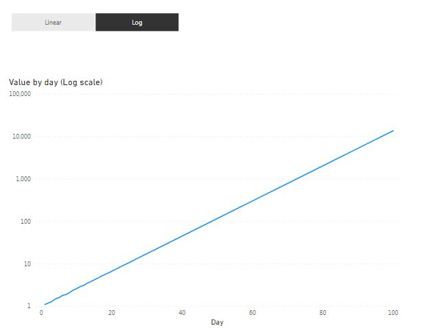
Then change Y axis scale type to Log:

We have a chart with Log scale. The only problem – Power BI doesn’t allow to change scale type dynamically. But there is a workaround.
Zero values are not allowed on Log scale. If there is any point with value = 0 on a line, then Power BI will switch Log scale back to Linear scale automatically. So, we need a measure that will return either 0 or BLANK() depends of our ‘toggle button’ state.
We will use a slicer as a ‘toggle button’.
Create a table (I used DAX table) with only one column and two values (“Linear” and “Log”):
Log / Linear Switch :=DATATABLE ( “Scale”, STRING, { { “Linear” }, { “Log” } } )
Now use this table to create a slicer:

Make sure it’s a single select horizontal slicer:


Now create a measure:
Scale Value :=VAR _scale =
SELECTEDVALUE ( ‘Log / Linear Switch'[Scale], “Log” )
VAR _blank0 =
IF ( SELECTEDVALUE ( Data[Day] ) = 1, 0, BLANK () )
VAR _result =
SWITCH ( _scale, “Log”, BLANK (), “Linear”, _blank0 )
RETURN
_result
This measure returns BLANK() values if “Log” value selected on the slicer and 0 (only for Data[Day] = 1, because we need only one point with Value = 0 to change graph scale to “Linear”) if “Linear” value selected on the slicer.
Add this measure to the graph. I also added a table visual with Data[Day] and [Scale Value] columns to show what values the measure returns depends on our ‘toggle button’ slicer (only for demonstration purpose):

When “Log” selected on the slicer, the measure returns only BLANK() values and doesn’t affect the chart at all.
Now select “Linear”:

Power BI changed axis Y to linear and we see our [Scale Value] = 0 point on the graph.
Final touches.
Make [Scale Value] point invisible (e.g. change it’s color to white):

And create one more measure:
Title Log / Linear Chart :=VAR _scale =
SELECTEDVALUE ( ‘Log / Linear Switch'[Scale], “Log” )
VAR _title = “Value by day (“ & _scale & ” scale)”
RETURN
_title
Use this measure as a title for the chart:

