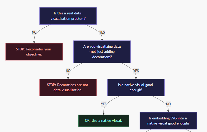
Should You Build a Custom Power BI Visual?
You have a data visualization problem, and you believe that it requires a new vibe-coded custom visual for Power BI on the Marketplace; here is … Read More
Blog by Andrzej Leszkiewicz. Power BI Developer and Consultant.
Power of Business Intelligence
Blog by Andrzej Leszkiewicz. Power BI Developer and Consultant.
You have a data visualization problem, and you believe that it requires a new vibe-coded custom visual for Power BI on the Marketplace; here is … Read More
Imagine sitting on a train, pulling out your Android phone, and working on a Power BI semantic model — creating measures, reviewing and documenting the … Read More
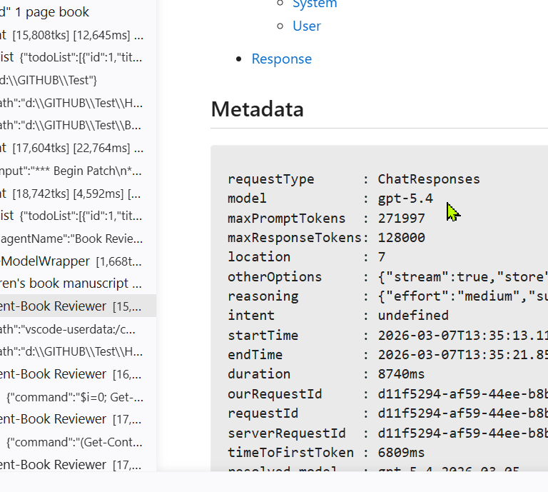
What you can’t find in VS Code GitHub Copilot documentation is a clear explanation of the following: 💡 If you expect that subagents will be … Read More
While everyone is using AI to replace core visuals with custom visuals using SVGs (I don’t like that trend), I do the opposite—turning my SVG … Read More
The Real Power of the New Slicers. Turn Your Slicers into Charts. Power BI and Fabric Summit 2026. February 24, 2026, online (day 2, virtual … Read More
This post was created by typing: “Connect to my website. Make a new post: ‘Testing an MCP server’ This post was created by typing: “Connect … Read More
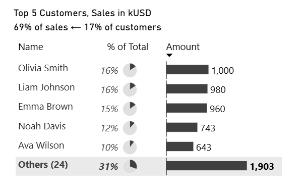
To show Top N records and all other records grouped into “Others” in Power BI, we used to create a new table in the data … Read More
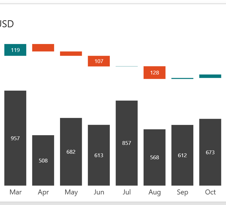
SVG image generated by a DAX measure allows the creation of custom charts embedded into Power BI core visuals (including slicers): table, matrix, new card, … Read More
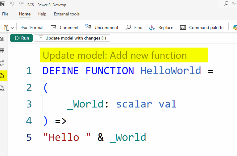
Now you can create your own DAX functions, reuse them in your reports, and share them with the community. Power BI Desktop: File | Options … Read More
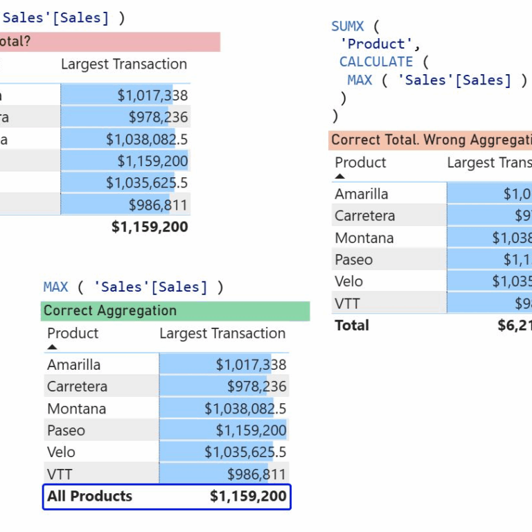
The total row in a Power BI table: Is it wrong? Let me tell you about the complexity of DAX, misleading terms like aggregators and … Read More